I was genuinely excited about an event last week. The speaker lineup looked incredible. The topic was exactly what I needed. I was ready to register.
Then I clicked the registration link on my phone.
The page loaded slowly. The form looked endless. I had to zoom in just to read the fields. And in that moment—that split second where enthusiasm meets friction—I thought "forget it" and closed the tab.
I never came back. The event organizers have no idea they lost me. They don't know I was interested. They don't know I clicked. They certainly don't know how many others they're losing the exact same way.
Here's what haunts me about that moment: it wasn't a decision. It was a reflex.
I didn't weigh the pros and cons. I didn't think "maybe later." My brain just instinctively rejected the friction and moved on. And I suspect this is happening thousands of times a day to event organizers who think their registration process is "fine."
The Silent Leak in Your Conversion Funnel
The data tells a story most event organizers don't want to hear: 70% of people abandon event registration forms. Only 3 out of 10 people who start your registration actually complete it.
Think about what that means. For every person who successfully registers, you've lost two others who were interested enough to click, engaged enough to start, but frustrated enough to leave.
The average abandonment time is 1 minute and 43 seconds. People don't even give your form two minutes before they're gone.
But here's what the analytics can't tell you: why they left. Was it "I'll come back to this later" or "this is way too much work"? Your dashboard shows the same abandoned session either way. And here's the brutal truth—when someone says "I'll get back to it," they almost never do.
There is no "later." There's only now, and your registration process just cost you another attendee.
The Invisible Tax of Every Form Field
I've watched event organizers defend their registration forms with the same reasoning every time: "We need this information to plan properly."
They need job titles for segmentation. Company names for networking. Phone numbers for reminders. Dietary restrictions for catering. T-shirt sizes for swag. Plus three custom questions about session preferences.
It all sounds reasonable when you're sitting in a planning meeting. But here's what that "reasonable" requirement actually costs you:
Each additional form field decreases conversions by up to 11%.
Let me put that in perspective. One study found that reducing form fields from 11 to 4 resulted in a 120% increase in conversions. You literally more than doubled registrations by asking fewer questions.
And it gets worse: 37% of people will abandon a form that asks for their phone number unless the field is optional. Making it optional nearly doubles completions.
So every time you add a "required" field because you think you need that data, you're not collecting valuable information. You're collecting reasons for people to leave.
The question isn't "do we need this information?" The question is "do we need this information right now, or can we get it later after they've committed?"
The Mobile Moment You're Missing
Here's the disconnect that frustrates me most: people discover events on their phones.
They see it in their social feed while waiting for coffee. A colleague texts them a link during lunch. They're scrolling through industry news on their commute. The moment of interest—that spark of "this looks relevant"—happens on mobile.
Then they click through to your registration page and hit a desktop-optimized form that's nearly impossible to complete on a small screen.
The data shows that 84% of people prefer to fill out forms on a laptop or desktop. But preference doesn't change behavior. Discovery happens on mobile. Sharing happens on mobile. Interest happens on mobile.
So you've created a system where people find your event at the exact moment of peak interest, then encounter a barrier that forces them to remember to come back later on a different device.
They won't remember. They won't come back.
And if they do try to complete the form on mobile? If your page takes longer than 3 seconds to load, 53% of mobile visitors leave before they even see your form. You've lost them before they had a chance to say yes.
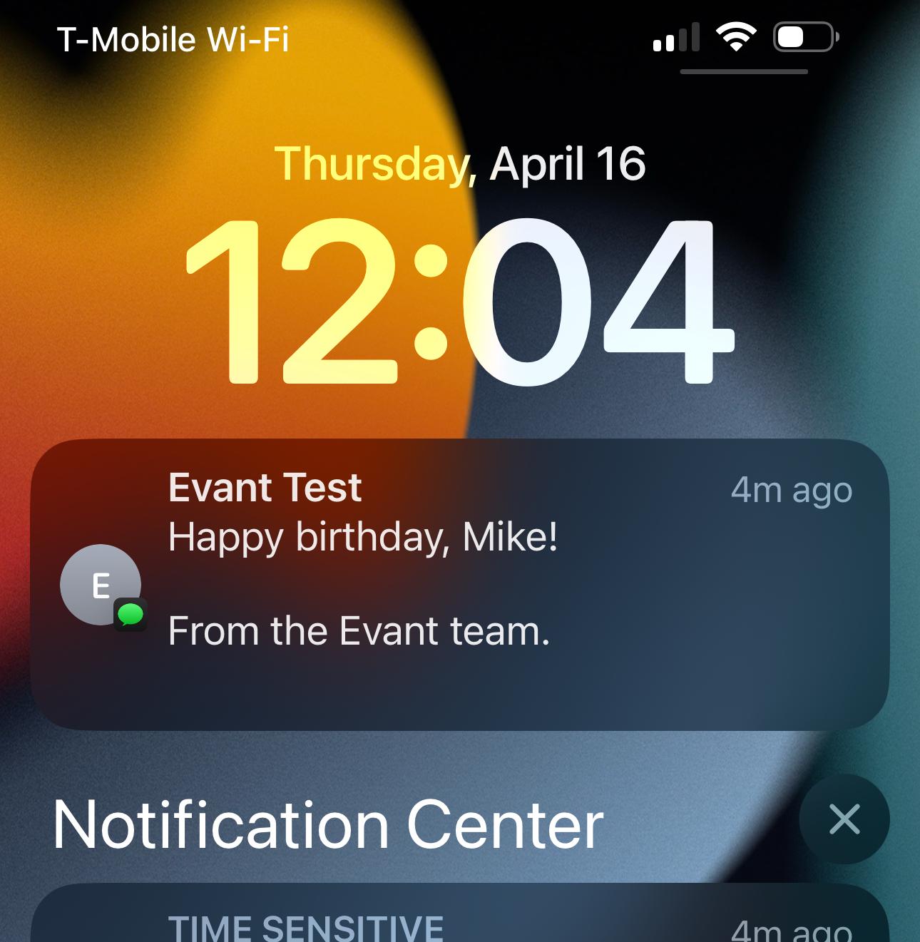
The Text Message Solution Nobody Wants to Try
I ask event organizers a simple question: Would you rather respond to a text message or fill out a long web form?
Everyone picks the text message. Every single time.
It's faster. It's easier. There's less friction. You're already on your phone. You can respond in seconds without switching apps or devices.
The data backs this up: SMS registration has a 12% conversion rate—2 to 3 times higher than email campaigns.Some industries see SMS conversion rates as high as 40%.
So why aren't more event organizers using SMS registration?
The answer I get most often is: "Because it's not the norm."
That's it. That's the entire reason. Not because it doesn't work. Not because attendees don't like it. But because everyone else uses web forms, so we use web forms too.
We're leaving conversions on the table because we're uncomfortable being different.
What Actually Needs to Change
If I could only fix one thing about event registration right now, it would be this: meet people where they are, in the moment they're ready to commit.
Stop asking for information you don't immediately need. Stop forcing people to navigate between multiple pages. Stop creating forms that only work well on desktop. Stop assuming people will "come back later" if your process is complicated.
The moment someone clicks your registration link is your moment of peak conversion potential. They're interested. They're engaged. They're ready.
Every additional click, every extra form field, every second of load time pushes them closer to that reflexive "forget it" I felt last week.
Keep it short. Save their information so they don't have to repeat themselves. Remove every obstacle between interest and commitment.
Because here's what I've realized: You're not losing attendees because your event isn't compelling. You're losing them because your website is too hard to use.
And the tragedy is, you'll never know how many people you lost. They'll never show up in your dashboard as "almost registered." They're just gone, leaving behind nothing but an abandoned session that tells you they visited but not why they left.
That's the real cost of friction. Not just the attendees you lose, but the opportunity you never knew you had.
Related Blogs
Top 7 SMS Trends for Communities in 2026
Michael PedoeemFrom AI-powered responses to text-to-donate and two-way texting — here are the 7 SMS trends every shul, school, and nonprofit needs to know about in 2026